

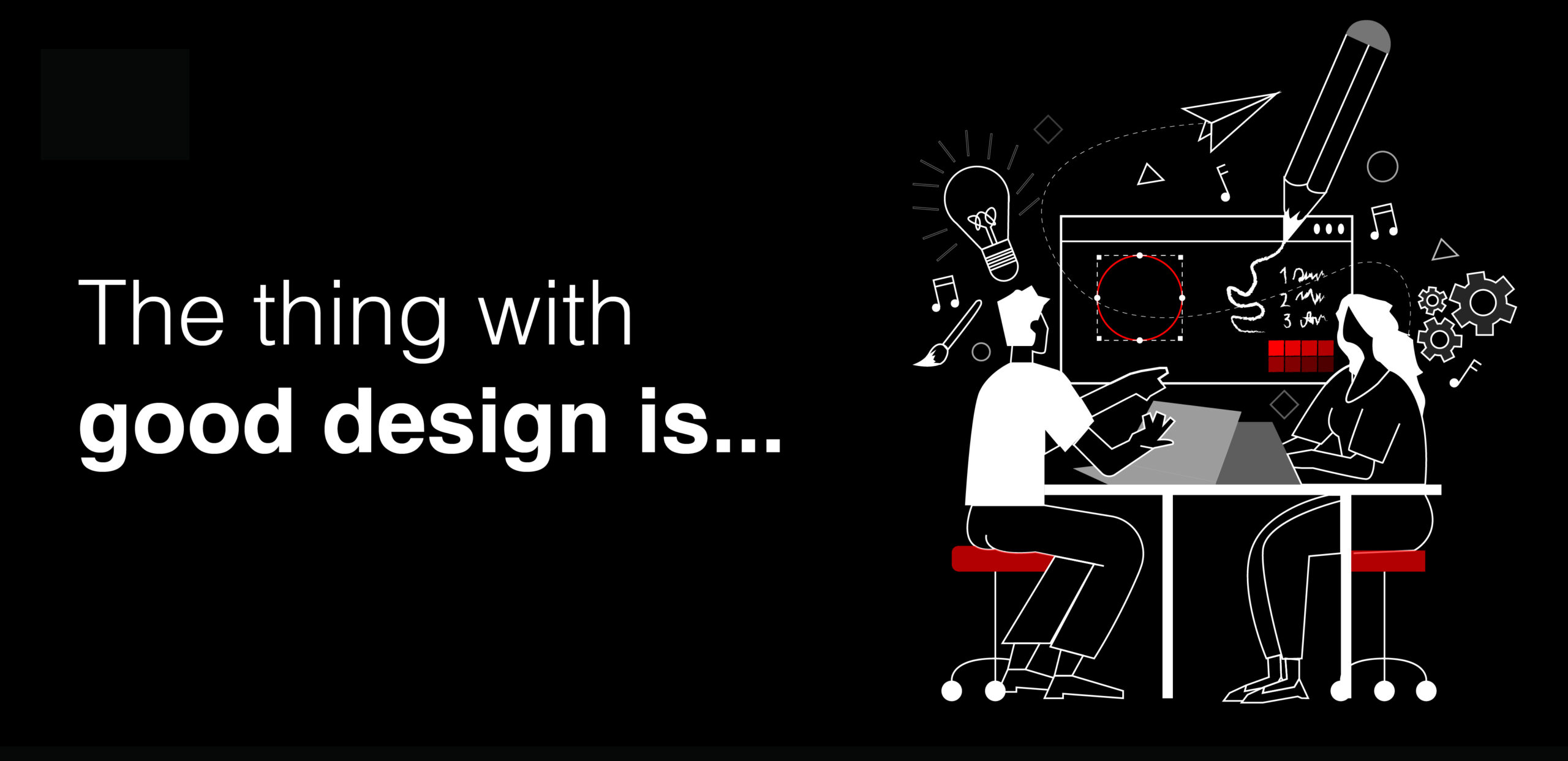
Good design is invisible
26 April 2024
The thing about good design is you don’t often know it’s good design. Because it just works.
Don’t get me wrong, design will give us those ‘wow’ moments and totally blow our minds. But 99% of design is totally unsung. It’s so good you don’t even notice it.
That’s not to say it’s easy, mind. It doesn’t just happen by accident. In fact, it’s actually an exercise in user experience. Let me explain.
Designing for the user
Someone once said, ‘the most important story you tell is the one in the mind of the reader’. The quote was actually about copywriting (I can remember that much, just not who said it!). Anyway, you could say something similar about design.
The important aspect of design is how it’s interpreted by the viewer. Therefore, everything is approached with that in mind:
- What draws you in?
- Where do you look first?
- What happens next?
- How do you get to what you need?
It’s how the mind works…
Have you heard of Gestalt theory? It’s a branch of psychology which says whilst the world is made up of lots of small parts, we process things as a whole.
So, when you look at a car, you see a vehicle, not a collection of wheels, lights, windows and sheet metal. When you look at spaghetti bolognese (my favourite), you see a meal, not a mound of beef (or, in my case, plant) bits, mushrooms, tomatoes ,and pasta.
Think of how complex the world would be if we processed everything there is to see. We have to make shortcuts. We do that by grouping things and seeing them as a whole.
If we didn’t, by the time we processed the sharp claws, big teeth, narrow eyes, etc, the angry bear would have made its own spaghetti bolognese… out of us.
Gestalt psychology is the foundation of good design.
The key principles
If we’re going to create visual things for people to process, knowing how they process them gives us a great advantage.
There are various principles at the heart of Gestalt psychology. Here are some of the key ones:
- Proximity – we make associations between objects based on their location. Where an object sits between two pieces of content, we assume it to belong to the one closest.
- Closure – we fill gaps between elements to create a whole image, even when there is not one. Dashes may form a circle, dots may create a square. We just need a suggestion of an image and our minds will do the rest.
- Continuity – we see things as related when they sit in line. We naturally follow a linear path and connect those things that sit along it.
- Figure/ground – we separate what we see as the focal point from what we see as background. Contrast often helps us identify the light on dark or vice versa, but colours and imagery mean it’s not always that simple.
- Similarity – we naturally group items together based on colour, size, and orientation. Objects with similar appearance are thought to have the same characteristics (all words highlighted in red must mean X).
With all of these in mind, a good designer can use spacing, contrast, hierarchy and everything at their disposal to create pleasing visuals that just work.
It’s an experience for the user, built around how their mind works.
The unsung heroes
So, each time you look at a brochure, land on a website or see an advert, and just naturally know where to focus, what to attend to and what to take away, – spare a thought for the designer.
They have built visuals to play into how you see the world.
They’re the ones who have worked hard, so ultimately, you don’t have to!
Get in touch if you need help visualising your story (we’ve also got a great Bolognese recipe too!)
Enjoyed this? You may also like...