Giving the EMEA Internal Communications a makeover
Insight
The internal comms team at Marriott International were both fairly new to the role so wanted to shake up the way they communicate messages, and the visuals that go alongside these. Previous communications were much more corporate, so they wanted to bring an element of fun; making all messages from the EMEA IC function consistent and recognisable.
Idea
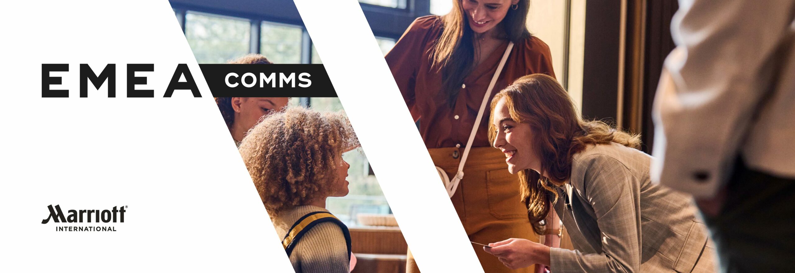
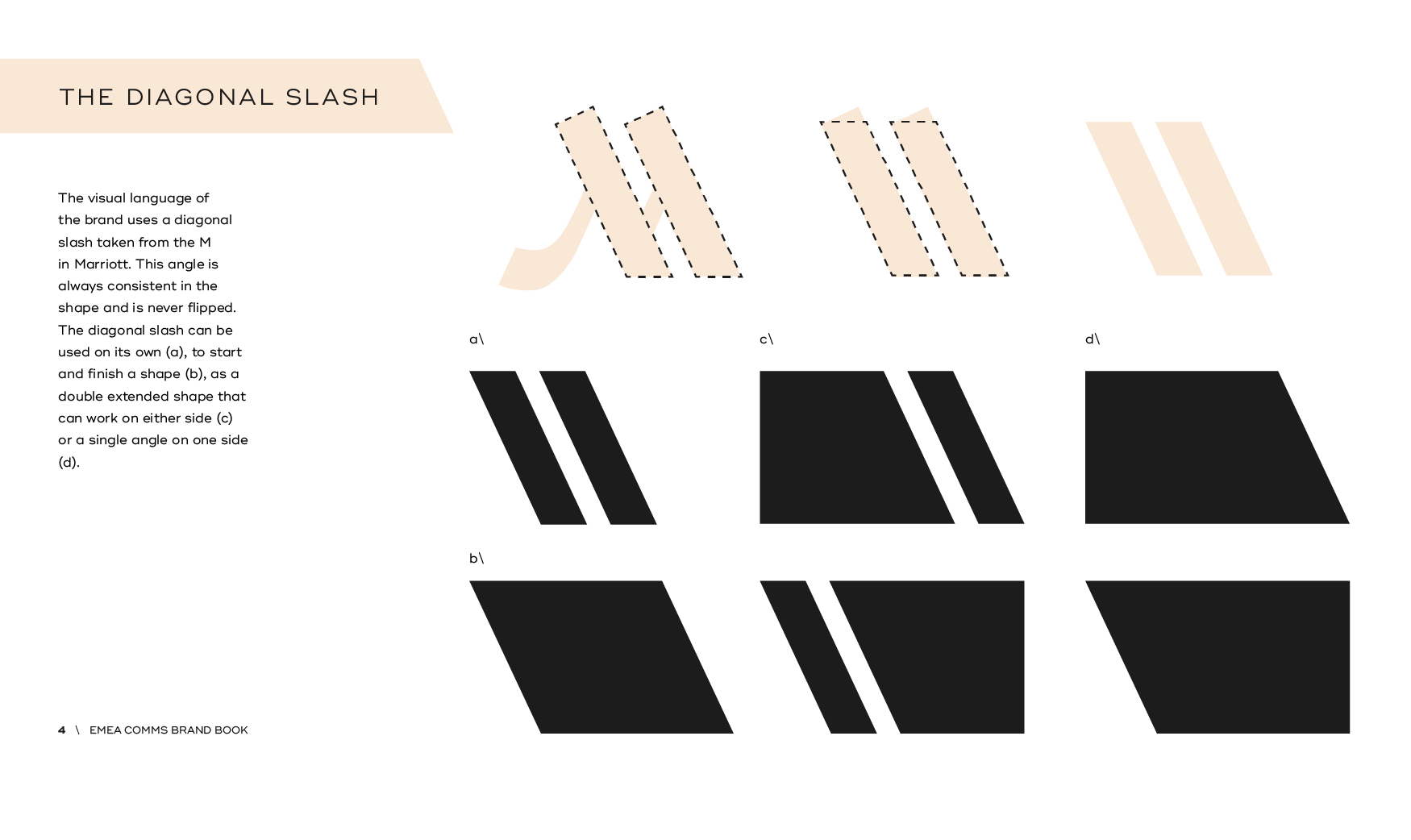
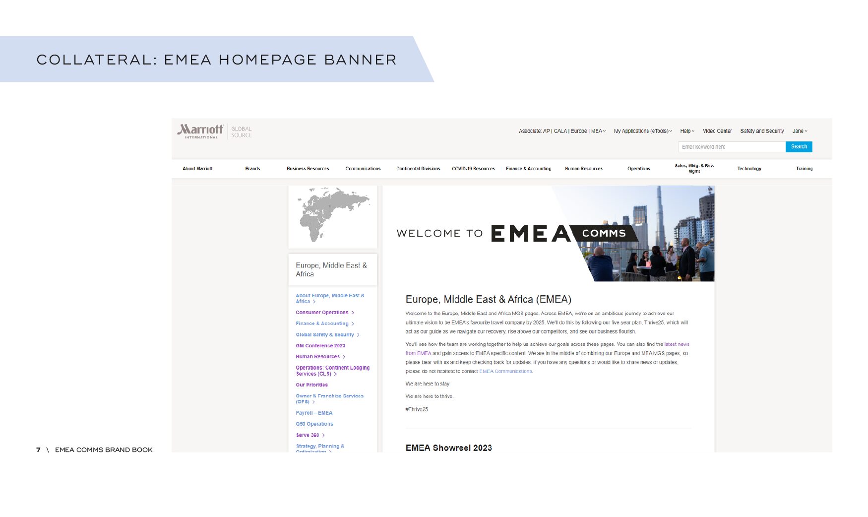
Using the corporate style, we wanted to create a standalone brand that was used for all internal communications coming from the EMEA IC team, but still making it recognisable as Marriott. We have used the angle from the Marriott font to create a slice graphic that houses elements including photography and graphics. And used the secondary colour palette to make the colours and content pop.
Impact
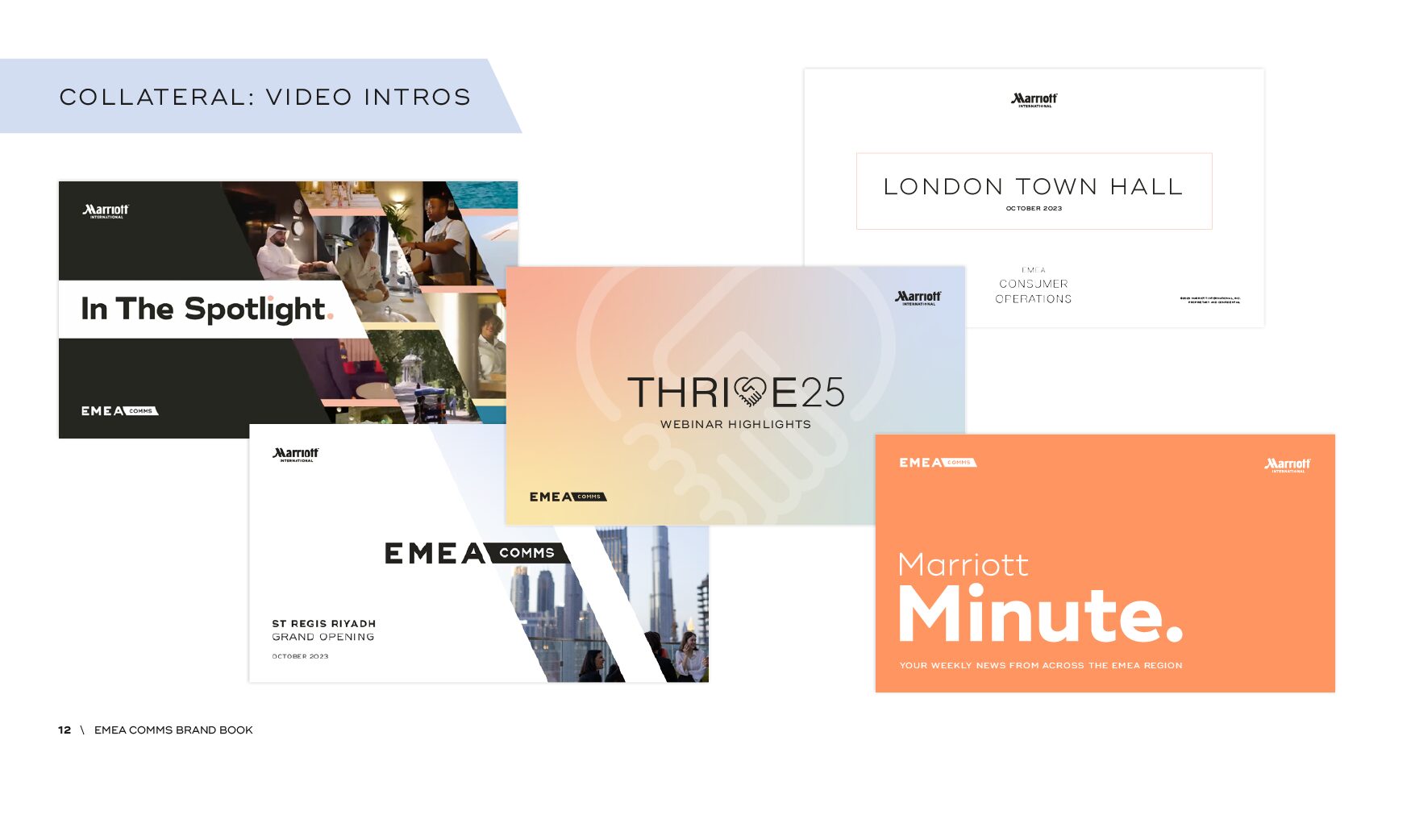
Since developing the brand, feedback from employees has been really positive. They love the vibrancy and consistency. As a development of the internal brand, we have used the style to create secondary styles for individual projects and campaign internally, such as the weekly newsletter and webinars.


