

Big fish, little fish, cardboard box – the secret meaning behind shapes and characters.
1 May 2026
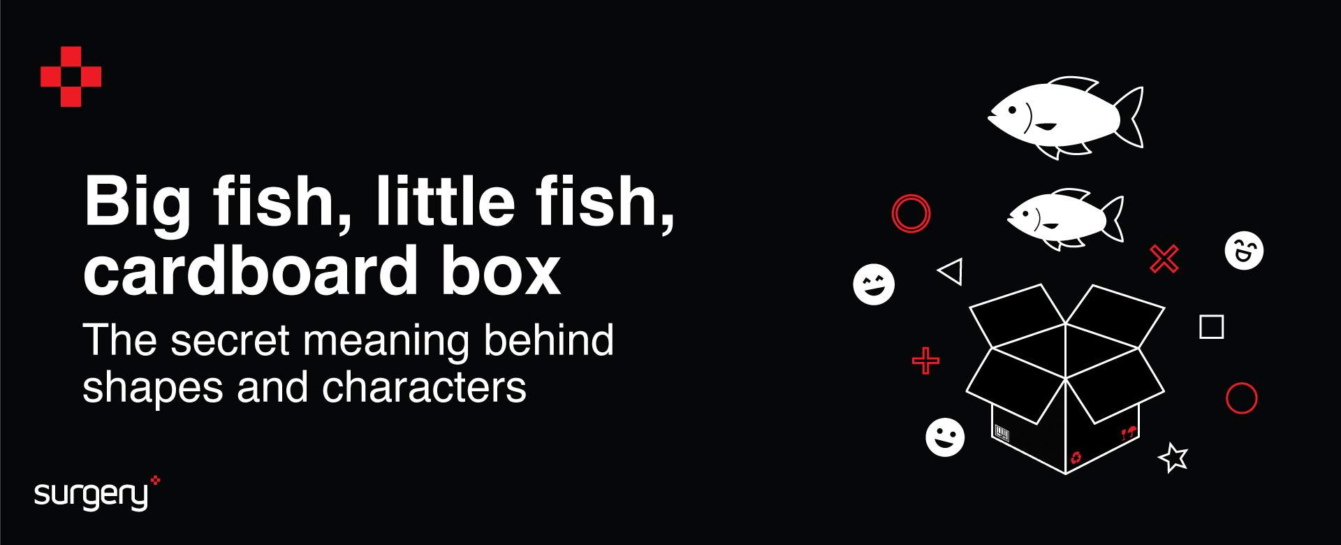
Big fish, little fish, cardboard box.
Is that how you throw shapes when you’re on the dance floor?
It’s probably been a while since you strutted your stuff (with confidence at least), we’re guessing.
But back when you were giving it your best Bee Gees moves down at the roller disco, we bet you didn’t stop to think that the shapes you were throwing actually might have some deeper meaning.
Okay, so maybe not the Lambada (keep up at the back there, Millennials!) or Grandad’s ‘sprinkler’ routine from your last family wedding.
Not those sorts of shapes, no. But as our incredibly talented Head of Animation, Bradley Poston, explains, shapes, colours, characters, and how you use them in design can ignite all sorts of emotions, vibes, and feelings.
Who knew, right? Well, apart from Bradley, obviously.
“Circles, for instance, feel soft and comforting. They impart a sense of approachability and safety,” our expert says.
“Squares feel grounded and dependable. They can be effective when you need clarity, structure, or authority, but you still want to avoid an overly corporate tone.
“Triangles feel energetic and directional; they could be good for highlighting change, urgency, or motivation,” he adds.
It’s all part of the tricks great designers have up their sleeves. Getting over messages, through brilliant design (and often without saying a word), is a powerful way to deliver change and a new way of thinking.
And, of course, it can emotionally tie people to what they are seeing.
GREAT DESIGN STAYS IN MIND
Great design is all around us. When you see something extraordinary, it stays with you.
“It’s not just shapes that have the power to do this; even the smallest variations in a character’s appearance can instantly change the mood,” Bradley explains.
“We can tailor visual character to the message before we even get into details.
“Characters are visual personalities that help make a message feel warm, relatable, and easier to understand,” he adds.
“The goal isn’t to make everything cute, it’s to make communication feel human and approachable. That could mean supporting complicated information, reinforcing cultural values, or simply giving people a reason to pay attention in a world of visual overload.”
In internal comms, getting cut through in a blizzard of messages means it has to work hard.
“The challenge isn’t that the messages fail, it’s that people are busy, distracted, and overwhelmed. We skim. We prioritise. We forget,” Bradley says.
“Adding a strong visual device, such as a character, can create an emotional hook that reinforces the message and makes it easier to remember.
“It’s less about replacing strategy or wording, and more about giving it a helper: something that connects emotionally and communicates tone instantly.”
As Bradley says, characters build warmth and work well because we are wired to notice personality and expression; we process faces faster than almost any other visual information.
“Giving comms a ‘character’ creates instant recognition and, over time, familiarity. They make the message feel like it’s coming from someone helpful rather than a faceless organisation,” he adds.
“A character helps create a story. Even if they aren’t telling a full narrative, they imply a voice and point of view that can guide employees through information, which helps it stick.”
A character doesn’t need to be detailed to communicate emotion clearly. Tiny changes, like the curve of a mouth or the direction of the eyes, can instantly shift tone.
“A slight slump can communicate concern; a frown signals disapproval,” explains Bradley.
“This is really valuable in internal comms, where tone matters, especially for topics that might feel tense, confusing, or unfamiliar.
“Expression and body language let us ‘soften’ instructions and make information feel like it’s coming from a helpful guide, not a directive
PROPS TO YOU FOR USING PROPS
Using props can pass on similar subtle language. They act like visual shortcuts; they let us communicate meaning far faster than text alone.
“For example, a bow and arrow instantly suggests aiming for a target, setting direction, or striving toward goals. It’s a strong metaphor for performance, ambition, or alignment,” Bradley explains.
“A calculator with a receipt can signal anything financial. A pin board evokes planning, reminders, or organising information, and a velvet rope barrier communicates exclusivity or controlled access.”
“A character isn’t a decoration; it’s a strategic device.
“Ask: Does this character make the message easier to understand, remember, or engage with?
“Does the character make the message feel more human and natural? “If yes, it’s doing its job.”
So, remember next time you frown slightly, or pick up a calculator, use a pinboard, or throw those triangles down at Cinderella’s in the High Street on a Friday night, you might be giving off more signals than you thought!
Tap into Bradley’s genius for your next IC project and deliver your messages through award-winning animation.
Get in touch today!
Enjoyed this? You may also like...